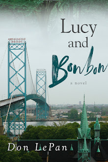
Sunday, May 24, 2026

The Art That's Hidden Away

The Globe and Mail published the first part of this essay as an opinion piece in their 23 May 2026 issue (I wrote the rest of it after I'd submitted it to them). Some interesting comments were posted online this weekend--including about the Vancouver Art Galley, which I was pleased to hear has just opened a new exhibition of works from its permanent collection. I will echo hazlit64's comment: "Finally. Indeed, it is about the best thing the VAG has done in ages."
The MacKenzie Art Gallery in Regina has a far more impressive permanent collection than do the public art galleries in many cities its size. As you’d expect, the collection has a range of pieces by Ronald Bloore and other members of the “Regina Five” from the 1960s, and significant paintings by the outstanding Saskatchewan landscape artist Dorothy Knowles. But the collection also includes work by a wide range of outstanding Canadian artists from all eras: Takao Tanabe is included, as are Alex Colville, Joyce Wieland, David Milne, Prudence Heward, A.Y. Jackson, Arthur Lismer, Lawren Harris, and mid-twentieth century abstract artists Jack Bush, Jack Shadbolt, and Agnes Martin. Some of the finest paintings by early Canadian landscape artist Homer Watson are part of the collection. And that’s just the Canadian side of things. Works by Andrea del Sarto, Irene Parenti Duclos, Eugene Delacroix, Pierre Bonnard, Edgar Dégas, Paul Gauguin, Edvard Munch, Pablo Picasso, Paul Klee, Frank Stella, Jasper Johns, and Andy Warhol are all part of the collection too.*

Homer Watson, The River Drivers (1914), part of the permanent collection of the MacKenzie Art Gallery.

And how many of those works were on display when I visited in early March? None. Other than a special exhibition of works (“Death Boat and other Stories: The Kampelmacher Memorial Collection of Indigenous Art”), there was nothing whatsoever on display from the permanent collection. The rest of the space was devoted to two large special exhibitions: a selection of photographic and conceptual art by Plains Cree artist Joi T. Arcand, and a selection of work (again, primarily photographic and conceptual) by recipients of the 2025 Governor General’s Awards in Visual and Media Arts.

I have no desire to criticize anything in the three exhibits on display. The background to the Arcand exhibit is interesting, and so are some of the pieces; particularly striking is an installation piece of a wooden chair inside a field of wheat inside the bare wooden frame of a farm building. Jin-me Yoon’s images of herself in front of iconic Canadian landscapes (part of the Governor General’s Awards winners exhibition) are striking too and, in the “Death Boat” exhibition of Indigenous art, Ananaisie Alikatuktuk’s 1976 stonecut of the Inuit sea goddess Taleelayu and her family is quite wonderful. The Joe Fafard cows in the outdoor sculpture garden are quite wonderful too. There are good things on display at the Mackenzie.

But a public gallery with a large permanent collection should surely be making an effort to represent the full range of our artistic heritage—and a full range of genres. Like many other public galleries across Canada, the MacKenzie has chosen not to do that. Canada’s Indigenous heritage is of vital importance, and it should always find expression in our public galleries. But so too is our heritage of European art and of art influenced by the traditions the European settlers brought with them. Implicitly, the MacKenzie suggests that the only heritage of great value in Canada is that of Canada’s Indigenous peoples.

Implicitly, too, the MacKenzie suggests that there is little value to the genres that for centuries were accorded pride of place in our heritage: painting (and in particular, oil painting), works on paper (whether watercolors or prints), and sculpture. Photographic art and video art, together with installations and other forms of conceptual art, now dominate much of the art scene. They should surely be represented in any public gallery, but they are not everything. Bonnard, Gauguin, Munch, Picasso, David Milne, A.Y. Jackson, Dorothy Knowles—to have all that wealth hidden away in your vaults and not show any of it? It’s an extraordinary imbalance.

It’s not as if the MacKenzie is short of exhibition space; a visitor can’t help but be struck by the amount of empty wall space in the foyer, the hallways, and so on. It would be easy to display a modest selection of works from the permanent collection without reducing one bit the amount of exhibition space devoted to the other exhibitions.

I’ve had very similar experiences elsewhere; in public galleries across Canada, our artistic heritage (with the notable exception of Indigenous art) is often all tucked away in the vaults; modern photographic art, video art, and installation and conceptual art are what’s on display. There are some in the art world who might suggest that there is a hint of the philistine, or even of the reactionary in anyone who still wants to see work by the Impressionists, or Alex Colville, or the Group of Seven, or Andrea del Sarto. But most of us who would like to see a broader representation of our art heritage on display do not want to push out the contemporary art and the Indigenous art; we would like to see it on display together with Indigenous works, and together with various sorts of contemporary art.

You can, of course, find work by artists such as Lawren Harris and Arthur Lismer and A.Y. Jackson in the MacKenzie Art Gallery, in the same part of the gallery in which they are to be found in every gallery across Canada: reproduced on postcards and teacups in the gallery shop. It seems crazy, but people still buy this stuff, in whatever form. It would be great if they could see the real thing as well as the postcards and the teacups.

* * *

Some may feel (and understandably so) that many of the artists represented in these permanent collections don’t deserve any more time in the limelight, that the Tom Thomsons and David Milnes and Paul Gauguins of the world—the white males who dominated for so long—have had their time in the sun, and deserve now to spend a good long time in the vaults. But it’s not just the long-dead white males that are being hidden away in the vaults; it's living artists too, very much including women artists and non-white artists. Check out the galleries that provide information on what’s in their permanent collection and you’ll find a vast store of works by Canada’s finest living artists—Angela Grossmans, Takao Tanabes, John Hartmans, and many more.

Not every gallery takes the same sort of approach that the MacKenzie does, of course. The National Art Gallery, The Museum of Fine Arts in Montreal, and the Art Gallery of Ontario are notable exceptions among our largest public galleries, as is the Beaverbrook in Fredericton, which boasts on its website that its “permanent collection’s core … has remained on view for most of the gallery’s 60-plus year history.” The Glenbow in Calgary promises to again be an exception when it reopens in 2027. And several others are at least partial exceptions; the Art Gallery of Victoria, for example, displays works from its permanent collection in at least two of the gallery’s seven exhibition spaces.** But take a look online at what’s on at the main public galleries in St. John’s, Halifax, Trois Rivières, Kingston, Peterborough, Guelph, London, Windsor, Thunder Bay, Winnipeg, Regina, Saskatoon, Edmonton, Kamloops, Kelowna, Vancouver, Nanaimo. Many of these galleries hold excellent permanent collections. Few if any make available much space to show the works in those permanent collections to the public.

Why not? Gallery curators have a ready answer; they just don’t have enough space.*** And it is indeed true that many galleries across Canada are short both of exhibition space and of storage space—in some cases critically so. But the assumption seems always to be that new, temporary exhibitions must take priority. Is there any good reason for that assumption? Why not look at things the other way round? If you have a truly outstanding permanent collection, why not give priority to that? However large or small your available exhibition space may be, why not devote at least one third of that available space to a permanent display of certain of the most important works from your permanent collection?**** Another third might be devoted to rotating displays of other works in the permanent collection. That still leaves a third for temporary exhibitions. In the United States the majority of public galleries seem to devote over 70% of their exhibition space to works from their permanent collection; in Cleveland and Portland, it’s 90%; in Minneapolis it’s 93%. In Winnipeg, on the other hand, it’s estimated to be less than 60%; in Quebec City, less than 50%. In Victoria, it’s 45%; in Vancouver it’s often less than 10%. In Peterborough, Lethbridge, Nanaimo, and various other Canadian cities, it’s often 0%.

* * *

In closing, I’d like to return to the T.C. Douglas Building in Regina, in which the MacKenzie Gallery is housed. Arguably the most interesting pieces of art on display in the entire building are Miki Mappin’s nine wonderfully evocative sculptures of human figures. They’re on permanent display, positioned on benches in the building’s atrium, which you pass through before you enter the gallery, and again when you leave. Reminiscent of the white plaster sculptures of George Segal, these figures are made of dark concrete; they have apparently been popular among visitors to the building ever since they were installed in 1982. There’s nothing there to identify the sculptor, but an extraordinarily informative attendant at the information desk provided me with a good deal of background information—including a photocopied article from the 18 November 1982 issue of Western People about the installation of the sculptures.

“Thanks so much for the information,” I said to her before I left. “These are really quite extraordinary—better, perhaps, than anything else on display in the gallery.”

“Oh, but these aren’t the gallery’s sculptures,” she said. “They were commissioned by the Ministry of Health.” She pointed to the other side of the atrium. “The Health Ministry occupies that half of the building—nothing to do with the MacKenzie Gallery.”
*A nicely produced 2013 book edited by Timothy Long & Stephen King, The Vaults: Art from the MacKenzie Art Gallery and the University of Regina Collections, provides a wealth of information on what’s hidden from view at the MacKenzie.
**Also on display in Victoria at the moment is an exhibition advertised in the 14 March issue of the Globe and Mail with a detail from Mary Pratt’s Cut Cake: “Historic and Post-War Canadian Art.” But that’s an exhibition at the Madrona Gallery, an outstanding commercial gallery; the works are all for sale. It’s an interesting commentary on the current art world in this part of British Columbia that, when it comes to nineteenth and twentieth-century Canadian painting, there are often far more important works to be seen at commercial galleries and auction houses—Heffel Fine Art in Vancouver as well as Madrona—than there is at any of the public galleries. One of the many ironies of the current art world is that many works of art that have been donated to public galleries in the expectation that they will be thereby be enjoyed by more people than if the works were sold off at auction, end up being seen by no one at all other than the gallery staff.
***A growing number of galleries are nowadays attempting to address their space issues by adopting a “visible storage” approach for much of their permanent collection, and a growing number too are digitizing much or all of their permanent collection. These are both real steps forward—but they are no substitute for having a significant part of one’s permanent collection displayed in proper exhibition galleries.
****Having too few works from their permanent collection permanently on display is a failing of more than a few public galleries. When space is allocated to works from the permanent collection, it’s often only on a temporary basis. That’s fine for most works in most permanent collections, but truly iconic works should always be on display—just as the Glenbow used to always have on display, Frances Anne Hopkins’s Canoes in Fog, Lake Superior and just as the National Gallery always has on display certain works by Monet, Brymer, Carr, Thomson, Wyle, LeMieux, Colville, Borduas, Riopelle, and Mary Pratt.

Sunday, April 26, 2026

Genocidal Intent, and the Quiet Deaths of Millions

Donald Trump’s early April statements of genocidal intent in the war he has waged against Iran have rightly received a great deal of attention—though no major news outlets I’m aware of have dared to describe them as “genocidal.” On April 1 Trump made the following statement: “We are going to hit them extremely hard over the next two to three weeks. We are going to bring them back to the stone ages where they belong.” That was not an offhand remark made in haste through a tweet on Truth Social; the words were part of a prime time address to the nation, and are recorded in the official White House transcript. A few days later (on April 7) he threatened similar action: unless Iran reopened the Strait of Hormuz by midnight that night, he declared, “a whole civilization will die tonight, never to be brought back again.”

Is it going too far to describe such words as statements of genocidal intent? A good many respected authorities have judged that it is not—among them Mathias Risse of Harvard University’s Center for Human Rights: “Trump’s statement,” Risse has written, “is the clearest case of declared genocidal intent in modern international criminal law.”

It’s worth comparing Trump’s words with the words that have been used by others inciting genocide. “If international finance Jewry inside and outside Europe should succeed in plunging the nations once more into a world war, the result will be not the Bolshevization of the earth and thereby the victory of Jewry, but the annihilation of the Jewish race in Europe,” Hitler declared on 30 January 1939.” All Tutsis should be "erased from human memory" and "wiped from the surface of the earth," blared radio broadcasts in Rwanda in 1993. The similarities are all too clear.

No one suggests that Trump and Hegseth will kill as many in Iran as the 800,000 who were killed in the Rwanda genocide or the 6,000,000 who were killed in Europe in the Holocaust.

Trump’s other actions, though, may result in the quiet deaths of many more. The most heinous action of the Trump administration—among seemingly endless heinous actions—may may be the decision early on to quickly and brutally shut down America’s foreign aid programs. One report—from the Harvard School of Public Health—estimates that the USAID shutdown has already led to hundreds of thousands of deaths (https://hsph.harvard.edu/news/usaid-shutdown-has-led-to-hundreds-of-thousands-of-deaths/); another—from an equally reputable source, the Lancet—estimates that the shutdown may well result in 14,000,000 deaths by 2030. (https://www.bbc.com/news/articles/cx2jjpm7zv8o ).

Quiet deaths from starvation or from lack of essential medicines may not have the worldwide emotional impact that deaths associated with the word “genocide” always seem to carry. But the millions of people dying probably won’t care what words are used to describe the horror.

These, of course, are not deaths in places that the likes of Trump have been in the habit of recognizing as “civilizations.” The great civilizations of Benin, or of the Mali empire, or of Great Zimbabwe are ones that Trump and the world of MAGA seem entirely unaware of. Their traditions are the traditions of what Trump, in one of the most horrific statements of his first administration, called “shithole countries.” Who really cares if people in those sorts of places die in record numbers?

If we do care, we should do more than care; we should press rich world governments not to follow Trump in cutting foreign aid—and we should give as generously as we can to every aid agency that is working to save the people that the Trump administration is happy to let die.

Iran, 1953: Eisenhower, Churchill, Mosaddegh

In discussing the history of US-Iran relations in the context of the current war, many media accounts go back as far as the upheavals of 1979—the overthrowing of the Shah, the installation of an Islamist regime, and the American embassy hostage crisis. Few, sad to say, go back as far as upheavals of 1952-53—the nationalization of the oil industry by Iran’s democratically elected government, led by Mohammad Mosaddegh; the attempts by Winston Churchill’s British government to persuade the US to help them overthrow that government; and the overthrow itself. In the October 9, 1953 entry in his diary, American President Dwight Eisenhower reflected on the nature of what his government (together with Churchill’s government) had done:
The things we did were “covert.” If knowledge of them became public, we would not only be embarrassed in that region, but our chances [of doing] anything of like nature in the future would almost completely disappear.
Knowledge of what they had done did eventually become public, and historians are nowadays all in agreement as to the basic facts. The summary in Brittanica says it well enough:
In 1951 … the Iranian parliament, led by Mosaddegh’s nationalist and democratically elected government, voted to nationalize the country’s oil industry. Seeing its interests thus threatened, the UK embarked on a secret campaign to weaken and destabilize Mosaddegh. At first the British government tried to convince the shah to remove Mosaddegh from office by engineering a parliamentary decree, a ploy that both failed and enhanced Mosaddegh’s reputation while diminishing the shah’s. When the push to remove Mosaddegh evolved into the idea of a coup to overthrow the government, Britain, reluctant to shoulder the responsibility alone, persuaded the U.S. to join forces by playing on Cold War fears that Mosaddegh, an avowed anticommunist, was aligning himself with Tudeh, the Iranian Communist Party.

The United States took the leading role in a covert operation, called Operation Ajax, whereby CIA-funded agents were used to foment unrest inside Iran by way of the harassment of religious and political leaders and a media disinformation campaign. These efforts, formally approved by President Dwight D. Eisenhower, came to a head in August 1953 when Mosaddegh and his government were overthrown and Mohammad Reza, a pro-Western monarch, was returned to power.
It’s no wonder that resentment of America runs deep in Iran.

An interesting footnote to all this is how Churchill has almost entirely escaped blame for his part in the coup. Notice in the Brittanica summary that Eisenhower is named, but Churchill isn’t; that omission is entirely typical of most accounts of the coup. The American presidents who appear in the standard narrative (Truman, and then Eisenhower) are identified by name, but the British Prime Minister is not. In this as in a number of other respects (notably, the Bengal famine of 1943, in which Churchill withheld relief supplies in a famine that killed millions), Churchill remains history’s Teflon leader, remembered above all for the undeniable greatness of his leadership in 1940, while somehow sloughing off any close association with less flattering episodes.

Saturday, April 11, 2026

The Woman Problem at the London Review of Books

I sent this letter to the London Review of Books March 22. I had assumed it wouldn't be published--since the LRB did publish a couple of other letters on Seamus Perry's 19 February article in their 19 March issue. (Interestingly, those letters continue the pattern of Perry's own piece; together they mention or reference eleven male writers, and no women.*) The LRB remains in many ways a wonderful publication, but when it comes to a fair representation of women it sometimes feels fifty years behind the times. Or indeed a hundred years. But I was happy to be surprised when they did in fact pubish a lightly edited version of the letter below in the 23 April issue. They cut my rather-too-snarky last sentence--just as well.
It is an extraordinary irony that, in an article on modern ideas of pluralism and diversity and on the “quality of sheer plenitude” in modern poetry (LRB, 19 February), Seamus Perry devotes twenty-three of his twenty-four paragraphs entirely to the writings of white males, all of them British or American (or, in the case of Auden and Gunn, a bit of both). The exception is the fifteenth of the twenty-four, which is also mostly devoted to the writings of British and American white males (Robert Browning chief among them), but which includes seven-words quoted from Elizabeth Bishop and six-words quoted from Dorothy Parker.

One wishes that Perry had either given a much narrower title to the piece or—better still—taken the time to dip into the work of a much wider range of modern poets. From Rossetti’s “Goblin Market” all the way to Brooks’s “The Lovers of the Poor” and beyond, there’s a wondrous range of “sheer plenitude” to be discovered. Much of it of high quality, and much of it of real interest—possibly even to white male writers at Balliol.**
*An extended quote from Chas and Dave's 1982 song "That's What I Like" is offered by one letter writer as a fine example of verse that evokes the "rich ordinariness of the modern world." They're nice enough lines, but nowehere near as nice as lines from any one of dozens of Carol Ann Duffy poems that evoke the rich ordinariness of the modern world.

**Seamus Perry, a professor of English literature at Oxford, was elected in May 2025 to become Master of Balliol College in July 2026.

Letter to the Globe: The Joy of Children - and of Parenting

The Globe and Mail published this letter February 21.
Re “Policy Alone Won't Fix Canada's Fertility Crisis": (14 February): Robyn Urbach is so right when she calls for not only a range of child-friendly and parent-friendly policy changes but also an attitudinal change—less emphasis on the costs of having children and the burdens of having children (real though those certainly are), and much more emphasis on the many ways in which raising children is a wonderful experience. Children are indeed a joy—and so is parenthood.

Saturday, December 13, 2025

Letter to the Globe: When Should a Business Raise Salaries?

The Globe and Mail published this letter in its December 13 issue, with only very minor editorial changes.
Re “As AI reshapes hiring, starting pay stagnates at Canada’s consulting firms” (December 5): Namaan Mian, chief operating officer of Management Consulted, is quoted as follows: “With firms able to attract all the talent they need and the quality of talent that they need, why would they raise salaries?”

I can think of a few reasons why businesses should raise salaries even when they don’t have to. Fostering a good work environment; making sure workers’ incomes keep pace with inflation; following the principle of basic fairness; acknowledging that we all have a responsibility to care for our fellow human beings—those are just a few.

Business leaders who believe they should only raise wages when market conditions force them to do so are the sorts of business leaders who turn young people (and many reasonable people of all ages) against capitalism.

Sunday, December 7, 2025

Label Things as What They Really Are: No More “Peanut Butter,” and No More “Hot Dogs”

When it comes to food, I am starting to understand just how badly I’ve been misled. For years now Maureen and I have enjoyed eating Tofurky sausages. Naturally, we’ve always assumed that these are genuine sausages, containing only the sorts of material you expect to find in a sausage—ground up bits of dead pigs and cows. (Is there any point in being fussy about which bits?) Now, thanks to the fuss over labelling made by several American states and, more recently, by the European Union,* we’ve realized that we’ve been misled all along. After hearing of their efforts, we took two packages of “Tofurkies” (as we have sometimes referred to them) out of the fridge and had a closer look. Sure enough, if you look closely at the label, you’ll see the word “plant-based” in large letters, right before the word “sausages.”

These aren’t made of pigs and cows at all!

Maureen discovers the truth about Tofurkies.


I’m sure that others have had similar moments with products that purport to be “milk”—and then, when looked at more closely, turn out not to come from a cow at all, but rather from soybeans, or oats, or almonds. (Maureen and I are relieved that we are able to correctly identify the sort of drink that's in our fridge—the brand we buy is labelled “soy beverage.” If it were labelled “soy milk,” I am afraid we would be completely misled, and think that it came from a cow.**)

I’m fully in support, then, of efforts to ban the use of terms such as “plant-based sausages” and “veggie burgers” in labeling everywhere—on restaurant menus as well as on products sold in grocery stores.

But these efforts do not go nearly far enough; companies should be banned once and for all from using all deceptive labelling.

I want to draw attention in particular here to two egregious examples. For as long as any of us can remember, mendacious companies around the world have used the name “peanut butter” to describe a product that contains no butter whatsoever. Let them call it what it is—squished peanut spread, or (shorter, simpler, and better), peanut goo. Calling peanut goo by a name that implies it came from a cow is utterly misleading and obviously unethical. It has to be stopped!

Even more urgent is the need to ban the offensive term “hot dog.” Some might argue that the term “hot dog” could perhaps be salvaged by making clear on the label what the main ingredient is—in much the same way that some companies already do with certain products, such as “all-beef hot dogs.” But that simply isn’t good enough; the term “hot dog” is itself powerfully deceptive. No one can fairly be expected to read a label with any care; even if the words “beef” or “pork” are included, thousands of innocent consumers are likely to continue to focus on the term “hot dog,” and thereby continue to be misled into thinking that the main ingredient in these products is dog meat.

And this is only the beginning. Some might imagine that the parties practising this sort of deception are all companies making products that are in reality plant-based. It goes further than that. As Maureen has pointed out to me, the so-called “head cheese” is not in fact made of cheese; it’s made from flesh taken from the head of a dead animal, which is then jellied. And it should thus be called “jellied head flesh.”

We have also discovered (we’ve been looking into all this a good deal) that “prairie oysters” or “Rocky Mountain oysters,” as they are sometimes called, are not oysters at all! They should be labelled as exactly what they are—cooked testicles.

And so-called “sweetbreads”? Bread is not in fact the main ingredient; they are pancreas glands, taken from young animals that have been killed—either calves or lambs. They should be labelled as what they are— “babe’s pancreas” would perhaps be a suitable moniker.

As readers, you are I’m sure already outraged. But it doesn’t stop there! I urge you to look in your medicine cabinets. Do you see “milk of magnesia” there? Like millions of others, you have been deceived; as Maureen has pointed out to me, there is no milk whatsoever in that product!

Please join me in the fight against this sort of outrageous mislabeling. I propose that we start as soon as possible an organization to fight such practices. Strict Honesty and Absolute Truth: A New Approach to Fighting Inaccurate Labelling (SHAT for short***) will be international, fair-minded, and relentless in pursuing those whose labels mislead. Please contact me right away if you are interested in joining.
* The European parliament recently voted 355–247 to ban “meat-related” names from being used on plant-based products. Sir Paul McCartney has protested, arguing that stipulating “that burgers and sausages are ‘plant-based’, ‘vegetarian’ or ‘vegan’ should be enough for sensible people to understand what they are eating.” With all due respect to Sir Paul, his argument is self-evidently absurd; it’s just too much to expect that we pay attention to the entire name of the product.
** A labelling issue that has yet to be adequately addressed is the question of whether what is normally in our society called “milk” should always be labelled “cow’s milk,” to distinguish it from the milk that comes from a human breast. But that might be taken to suggest that cow’s milk is actually intended for a baby cow, when we all know that the baby cows are intended to be taken away from their mothers at birth so that the mother’s milk can be drunk by humans. A full exploration of that topic, though, is perhaps best left for another day.)
***Some might regard the acronym as unfortunate; my own view is that the acronym may in fact assist the cause, by reminding people of one of the often-unacknowledged ingredients in sausages and other meat products—fecal matter.

Friday, December 5, 2025

Potato Prints: A How-to Guide

From time to time people ask how I make the sorts of cards I've been sending around at this time of year for the past twenty years or so. I made a bunch of potato poinsettias today, and Maureen took two pictures. I will attach those now, and provide tips on how to make a great potato print.

Lay out a section or two of a real newspaper. Not the electronic ones--they really, really will not work so well.

Preferably, make it a prestigious newspaper--the New York Times is ideal. (Look carefully, and you'll notice that the Sunday NY Times Business section is spread out here.)

Drink some beer. This is not essential, but it definitely makes the next step go more smoothly. In the photograph below, note the pint glass of beer, no longer full, partially hidden behind my hand.

Cut the potato, following some design you've figured out beforehand. (If you have a partner, ask them what might work well for a potato print design; this year, Maureen tactfully steered me away from trying to capture Seattle's Smith Tower in potato form.)

Apply paint to the potato. This year it was deep cadmium red plus alizarin, with a splash of regular cadmium red. Combining those colors is evidently how God makes poinsettias.

Press potato onto the pieces of paper that you've folded beforehand, ready for the aforementioned wet potato.

Revove potato from paper.

Repeat.

Use only russet poatoes. Russet potatoes are pretty crappy to eat, but they sell a lot of them in stores, no doubt because they're so good for making potato prints.

The cut-out parts of the potato will start to deteriorate and fall apart after about 50 impressions. All great print-makers face this problem; throw the potato away when you reach this point.

Buy stamps. Support your local post office.

Write messages to your friends on the cards, and send them. (The potato cards, not the friends.)

Repeat yearly.

Wednesday, November 26, 2025

Skyscrapers by Du Blois, Beersman, and Dinkelberg: Giving Credit Where Credit is Due

For many decades there were very few women architects, and those who did manage to achieve great things got little or no credit for it. Gordon Bunshaft of Skidmore, Owings & Merrill, for example, was long given sole credit for two iconic Park Avenue skyscrapers, Lever House and the Union Carbide Building; now it’s acknowledged that Natalie Du Blois played at least an equal role in the design of both. Thankfully, the profession is finally well on the way to acknowledging the contributions of Du Blois and of many other previously neglected women architects.

But the architecture profession has barely begun to resolve another long-standing issue in the matter of giving credit for buildings—an issue unrelated to gender. The 1902 Flatiron Building in New York is generally credited to Daniel Burnham (or to his firm—D.H. Burnham and Co.), when in fact it was designed primarily by Frederick Dinkelberg, a young architect working for Burnham & Co. The 1921/1924 Wrigley Building in Chicago is more often than not credited to the firm Graham, Anderson, Probst & White, when in fact it was designed by Charles Beersman, a young architect at that firm. The Empire State Building is generally credited to the firm Shreve, Lamb & Harmon, when in fact it was one of those three, William Lamb, who was the building’s principal architect.

Those are historical examples, but the pattern has continued in the late twentieth- and early twenty-first centuries. The 1982 Petro-Canada Building in Calgary and the 1989 Scotia Plaza in Toronto, for example, are both credited to the firm WZMH (Webb Zerafa Menkes Housden); who knows who the principal architect was? The Steinway Tower in New York and the Hudson’s Detroit tower are both credited to the firm SHoP; who knows who the principal architect was? Skidmore Owings & Merrill gives credit to architect Bruce Graham for the Sears Tower in Chicago and to architect David Childs for One World Trade Center in New York, but Skidmore, Owings & Merrill buildings such as the 2019 tower at 1865 Broadway and the 2023 Hangzhou Wangchao Center are credited only to the firm.

Imagine if a scholarly article by three Princeton University academics were credited only to “Princeton University.” Imagine if Botticelli’s Birth of Venus were credited only to the “firm” that commissioned it—the Medici family. Yet that is essentially the approach still taken by many architectural firms.

From one angle, it’s a quite defensible approach; for a moment, let’s look at things from that angle.

For my recent book of watercolor paintings, The Skyscraper and the City, I wanted in the long captions to give credit as much as possible to the architects of buildings I particularly admired. One of these was (and is) One King St. West in Toronto, a stunning sliver of a skyscraper that retains at its base the historic façade of the bank building that once occupied the site. It’s credited to Stanford Downey Architects. I emailed the company to ask if they could put me in touch with the principal architect, and they were kind enough to connect me with one of the company’s senior architects, James Rasor. I had anticipated that he would be pleased to be identified in a book as the principal architect of a building that was clearly being given very positive coverage. Not at all: he asked that his name not be used in the book. In his view, notable buildings are always the product of a team effort; giving credit to just one person does not acknowledge that fact.

Fait enough, I thought, and I did as he had asked for the book. An admirable expression of modesty and team spirit, it seemed to me—and still does seem.

And yet.

To name none of the members of the team, but only the company they work for, seems in the end an unsatisfactory way of apportioning credit. Why not do as academics do when it’s a team effort—give credit for an academic article to two, three, four, even six or seven researchers (with the person who has taken the lead always listed first)? That can be long-winded, of course, if one is trying to reel off a list of authors, but it’s not much more long-winded than reeling off “Graham, Anderson, Probst & White” or “Melvin L., Harry A. & Curtis King Architects.” And when crediting the authors of academic research papers, it’s common practice to use “et al.” as appropriate.

But the lead contributor should surely come first; if the Flatiron Building is not to be credited solely to Dinkelberg, then it should be credited to Dinkelberg and Burnham, not Burnham and Dinkelberg.

The cause of giving credit where credit is due is given a welcome and wonderful boost by the research of Robert Sharoff, whose book The Wrigley Building; The Making of an Icon was published earlier this year. Sharoff and his collaborators (Tim Samuelson [Commentary], John Vinci [Introduction], and William Zbaren [Photographer]) have created a marvelous volume—and a book that finally gives full credit to Charles Beersman as the building’s lead architect. Sharoff has uncovered a great deal of information not only about the Wrigley but also about Beersman; it’s a beautiful book and a readable book, but also an important book of architectural history.

I was honored to play a small part in an event last week at the Skyscraper Museum in New York that was held to celebrate the publication of The Wrigley Building: The Making of an Icon. (Warm thanks to Skyscraper Museum founder and Director Carol Willis as well as Programs and Operations Head Dan Borrero for making the event happen!) Sharoff and his collaborators gave fascinating talks on Beersman, Wrigley, and the building itself, and then Gail Fenske and Tom Leslie gave an excellent presentation comparing the Wrigley with the Woolworth Building and other New York skyscrapers. Fenske’s last slide was an image from John Marin’s great series of watercolors of the Woolworth Building; my short presentation on The Skyscraper and the City, which ended the evening, began with a slide from the same John Marin series. All in all, it made for a quite delightful evening—for me, not least of all because I had a chance to look around the Skyscraper Museum, which I had never visited before. If you're in New York, I strongly encourage you to check it out!

Chicago (1997) [detail]: The Wrigley, Jewelers' and Mather Buildings

I’ll end by recommending two other skyscraper books—Fenske’s The Skyscraper and the City: The Woolworth Building and the Making of Modern New York and Leslie’s Chicago Skyscrapers: 1871-1934 – both of which are wonderfully informative and wonderfully well illustrated.


* * * * * *

As a postscript, I’ll paste in below two of the short skyscraper stories that are appended to my 2016 novel, Rising Stories—-two stories in which young Robin Smith learns something of Beersman and of Dinkelberg from the aging K.P. Sandwell. What Sandwell says of Beersman was correct in 2016; the world knew “almost nothing” about him. Thanks to Sharoff, that’s no longer true.

The Wrigley Building

“If you’re going to learn about the Wrigley Building,” K.P. began, there are two people you should know about first. The strange and rather sad thing is that I can only tell you about one of them.”

“One of them was called Wrigley. Did I guess it?”

K.P. smiled. “You are not quite as clever as you think, you know, Robin. But yes. One of them was called Wrigley. William Wrigley Jr., he was. He grew up in Philadelphia, where William Wrigley Sr. made soap. No, that’s putting it wrongly. Where William Sr. owned a soap company—I very much doubt he did any of the actual making of the stuff. Little William was evidently something of a trouble maker; he kept getting expelled from school—he once threw a pie at the principal, I believe. When he was ten he ran away from home. He made his way from Philadelphia to New York and stayed there for a whole summer; he worked as a newsboy and he slept on the street, or so the story goes. He did go to work in the soap business by and by, but a sort of restlessness must have always stayed inside him. He ran away again when he was nineteen, but lost his railway ticket in Kansas City and came back to Philadelphia, broke. By the time he moved to Chicago he was not yet 30, but he had worked on and off in the soap business for almost 20 years. His big idea in business was to give people something for free—‘for nothing’ was what he called it. ‘Everybody likes something extra, something for nothing,’ that was Wrigley’s motto.

“Little William wasn’t a rich man. He had almost nothing himself; William Sr. thought a man should have to earn his way. The boy—the man, I suppose we must start to call him at this point in the story—had gotten married when he was twenty, and was earning $10 a week. He had gotten himself a wife, and soon he had a daughter too. That’s when he came to Chicago. It was 1890. There were a million people here but there were still no skyscrapers.”

“Was it in Chicago that he started making gum, then?” Robin paused. “I mean, started a company that made gum?”

“Not at first. At first he was selling soap and he offered baking powder as a premium. There seemed to be more interest in the baking powder than the soap, so he started selling baking powder—offering chewing gum as a premium.”

“That was like a prize?”

“I suppose you could call it that. Only it turned out that people wanted the gum more than they wanted the baking powder. I find that impossible to imagine. Do you like to chew gum, Robin?”

“I do, Granny.”

“You and a billion other children. Unfathomable. But yes, evidently people wanted the gum more than the baking powder. And so he borrowed $5,000 from his uncle. Not from his father, the soap maker—that’s an interesting detail. And with the $5,000 little William started his gum company.”

“And made Juicy Fruit, and made Doublemint, and made the Wrigley Building?”

“One step at a time, Robin, one step at a time. There was no Doublemint at first; what Wrigley’s made at first was called Lotta Gum. That was for children…”

“Makes a lotta sense, Granny.”

“I’m sure it does, child, I’m sure it does. It was also for grownups, apparently—grownup men, supposedly grownup men.”

“Not for women?”

“No, the women were evidently thought not to care so much as the men did about quantity. William wanted classy for the women, and that meant a different name for their gum. ‘Vassar Gum.’ I will tell you another time about Vassar.”

“All right, Granny.” But there was a pause. K.P. had suddenly lost the thread. There was a strange light in the sky. You often got that light over Lake Michigan at this hour, this time of year. Dusk. She could remember…

“The building, Granny. You’re telling me about the Wrigley Building now.”

“So I am, child. So I am. The building, and who made it. A lot of people have written about how wonderful Wrigley was. Larger than life, they say. How he gave his workers Saturdays off when everywhere else people had to work a half day Saturday, a full day sometimes. How he put baseball games on the radio when everyone else thought that would just encourage all the fans to stay home. And he… —no, I am just going to tell you about the building.”

“Yes, Granny. The building, Granny.”

“Wrigley wanted height, wanted graceful height for his gum temple. But with the Wrigley Building, the height is just a small part of it. Sometimes people make it sound as if the design was ersatz—more or less copied from some Spanish cathedral, or from the Woolworth Building in New York. But it isn’t like either of those. Even the tower is only a little bit like that silly Spanish cathedral. And there’s so much more to the whole thing than the tower.”

“The angles are all set at an angle—I remember you said that when I was here before, Granny.”

“And the proportions, child. I trust I told you about the proportions.”

“You told only me a little,” Robin lied. “Who made the angles and the proportions Granny?”

“That’s just what I was getting to, child. No one has ever heard of him. It’s the most famous building in Chicago, and no one has ever heard of the person who made it.”

“Made it, Granny?”

“Who designed it, Robin. Who made the designs. Sometimes people mention the firm—Graham, something, something and something. One of those firms where a lot of people have jostled to have their own name be part of the company name, where everyone wants to be known and remembered. And of course the more names there are, the more forgettable it all is.”

“So Graham and the Somethings had nothing to do with the Wrigley Building?”

“Graham may have done. But none of the Somethings, so far as I know. Mainly it seems to have been a young man named Charles Beersman. And we now almost nothing about him. Oh, there are some basic facts. I said ‘young’—he was just over thirty when he came to Chicago and joined Graham and all those Somethings in 1919. The Wrigley Building must have been just about the first thing he worked on—they broke ground for it in 1920. Beersman came from New York but he went to university in Philadelphia. We know that he won a fellowship there and we have a list of some of the other buildings he designed later. The Federal Reserve Bank of Chicago may be the best known of them. It’s a design in a certain sort of classical style, Greek pillars slapped onto a very ordinary skyscraper. Nothing hideous about it but nothing very remarkable either. Copying Greeks badly: it’s been done a million times before, and a million times since. And maybe the Wrigley Building began with copying. Copying that cathedral, copying those towers in New York—the Woolworth Building, the Municipal Building, the Metropolitan Life Building. But something magical happened. Maybe Beersman was pushed into genius by the lines of the street and the river. By the way they push together, those strange angles. Whatever it was, it was genius. And then nothing, nothing that he is remembered for. No one remembers what he was like, no one remembers his name. I tried once to look up something about him—there is almost nothing. When I was a toddler he was getting married; that much there is a record of, you can find it in The New York Times:
Mrs. Sarah L. Broffe of 149 Lexington Avenue announces the engagement of her daughter, Miss Beatrice Livingston to Charles G. Beersman, of this city. Mr. Beersman is an architect at 18 West Thirty-fourth Street. He was graduated from the University of Pennsylvania and is a member of the Acacia Fraternity.
Who were these people? Were they happy? How did Beatrice take to Chicago? Did they grow rich? Did they…? There are so many questions, and none of them can be answered. Beersman died July 29, 1946, aged 58. A more or less forgotten life, a more or less forgotten man.”

“But you remember things about him, Granny.”

“This evening, perhaps. As a shadow, as a name, a name to give to something that was human and that gave shape to the finest of all the buildings in this city. But a name and a shadow only. And only now: there is no forever to it. Tomorrow morning there may be nothing there.”

“The building will be there, Granny.”

“Yes, child. The building will be there. There will be no earthquakes, and the building will be there in the morning.”


Dinkelberg, the Flatiron, and the Jewelers’

“Frederick Dinkelberg had worked for Daniel Burnham, you see.”

“Who was…”

“Burnham and Root was the top architectural firm in Chicago. They made their money making grand houses for wealthy meat makers, businesssmen who had grown rich by being cruel to cows and to pigs. But then Burnham and Root turned to skycrapers. Root died young, but Burnham went on to greater and greater things. So it was that Dinkelberg became involved in some of the greatest skyscraper projects of the time. He was the main architect for what some still say is the finest of them all, the Flatiron in New York—a building credited not to him but to ‘D. H. Burnham & Co.’ Burnham himself was too senior, too busy—how often that happens in life! That was—” What year had it been? K.P. could not come up with a number. “It was early in the century. The century that’s over now,” she added. “Like Burnham, Dinkelberg never believed in architecture that would break new ground. He…”

“You always have to break the ground to build a building, Granny. You…”

“It’s a metaphor, Robin. A figure of speech. They never believed in architecture that would do anything radically new or different. Burnham and Dinkelberg always wanted a bit of ancient Greece and Rome on the outside, even if the skeleton was modern steel. Nothing revolutionary, they insisted—and yet what an extraordinarily bold thing the Flatiron was! The Fuller Building, I should say. That’s what they called it originally, for the company that had commissioned it. But even before it was finished people called it the Flatiron, for the shape of the space it occupied. Not everybody was happy. Let me read you what Life magazine said.” K.P. fumbled for a few moments amongst all the books until she found the one she wanted, a whole book about the Flatiron. “Here it is—I’ll read it to you:
In this partly civilized age and city, it is proposed to erect on the flatiron at Twenty-third Street an office building more than twenty stories high. New York has no law that restricts the height of buildings, and there is nothing to hinder the consummation of this appalling purpose. Madison Square ought to be one of the beauty spots of the city. It is grievous to think that its fair proportions are to be marred by this outlandish structure.
Of course all that conservative huffing and puffing was soon forgotten. Within a few years everyone loved the Flatiron—the outlandish had become the iconic.”

“Translation?”

“The thing that had been mocked had become revered.” Would the child understand revered any better than iconic? One couldn’t explain everything. “That was the Flatiron. But then Burnham died, and the firm went into decline. Dinkelberg struck out on his own with a colleague, Joachim Gaiver, an engineer. The company they started took on all sorts of work, but they only received one commission to build a skyscraper—that was the Jewelers’ Building. Commissioned in 1924, constructed 1925-27, and for a brief time “the tallest building in the world outside New York City.” The style was old fashioned—Dinkelberg never gave up the fondness for Greek and Roman classicism he had shared with Burnham. But it was very modern in its way; instead of having an airshaft in the middle of the building, Gaiver and Dinkelberg used that space for cars. It was the 1920s, and most everyone wanted an automobile. Mothers especially wanted to have a secure place to park their car so that they could take their valuables straight from the safe in their office to their vehicle and then drive to—well, to wherever they needed to go. That was the idea, anyway, and a clever idea it was. Gaiver and Dinkelberg built 23 floors of garage in the middle of the Jewelers’ Building.”

“But you can’t park there now.”

“When does anything turn out exactly as it has been planned? The Jewelers’ Building had been commissioned on the assumption that jewelers would love to have one building where they could carry out all their transactions—everyone in one convenient place instead of strung out along Wabash Avenue. But for whatever reason the jewelers decided they preferred life on Wabash; almost none of them moved into the new building that had their name on it. And the garage? Well, it wasn’t used by people visiting their jewelers. Pure Oil took over most of the building, and had it renamed, and the executives loved having such a convenient place to park their cars. But their cars quickly got larger, and the tight turns on the ramps of the garage in what was now the Pure Oil building didn’t change their size or their shape at all. By the 1940s Gaiver and Dinkelberg’s wonderful idea wasn’t working anymore. They made all that garage space into storage space and dingy cut-rate office space with no light. Only now, in the twenty-first century, has the Jewelers’ been made elegant and beautiful again.”

Sunday, October 26, 2025

Ready to Pounce if you Mispronounce: Smaller Wrongs and Larger Wrongs

The pronunciation of Zohran Mamdani’s last name has become a minor issue in New York’s mayoralty campaign; the name has been widely mispronounced, with by far the most common mistake being the transposition of the M and the N (saying Mandami instead of Mamdani).

Such mispronunciations have been “called out” as racist by a number of voices on the left. In a July 1, 2025 posting about Mamdani on BoingBoing, for example, Jennifer Sandlin condemns the “racial microaggressions of mispronouncing” Mamdani’s name: “one form of racism that seems more subtle but is as destructive as more overt and blatant racism,” she insists, “is mispronouncing a person’s name, a racist microaggression.”

But does this sort of thing in fact constitute a racist microaggression? I think it’s fair to say that mispronunciations can sometimes be microaggressions; if the mispronunciation is repeated again and again, and the speaker is making no effort to get it right, it seems fair to characterize that as a microaggression. (Donald Trump is perhaps the world’s worst repeat offender in this category.) But mispronunciations—even repeated mispronunciations—can also be quite innocent. And, in the case of Mamdani’s name, it’s entirely understandable that English speakers unfamiliar with the name will tend to pronounce it wrongly. A very good October 22 New York Times article (“Why Can’t People Say Zohran Mamdani’s Name Correctly?,” by Emma Fitzsimmons, Benjamin Oreskes, Eden Weingart, and Aliza Aufrichtig) points this out, quoting Professor Laurel MacKenzie, co-director of the NYU Sociolinguistics Lab: “Mamdani has an ‘M’ next to a ‘D’, and that’s hard for English speakers. Our tongues are just not used to making that specific sequence of sounds.”*

In the article MacKenzie is not quoted as having given any explanation for why it should be hard, so I asked another professor (Maureen Okun, who for many years taught linguistics at Vancouver Island University and who is my at-home source for information of an almost infinite variety of types). When we make an “N” sound, she explained, our tongues are right near the front of our mouths, behind our upper teeth—-which is also where our tongues need to be if we’re going to make a “D” sound; the transition from one to the other thus comes very naturally. When we make an “M” sound, on the other hand, our tongues are typically a little farther back, since the sound is articulated by pressing our lips together; it’s thus more difficult for us to transition from an “M” sound to a “D” sound.

The substituting of an “N” sound for an “M” sound in such circumstances is an example of metathesis, a common phenomenon involving the transposition of sounds in order to make a word easier for us to pronounce. Metathesis, it should be emphasized, often occurs without our even being aware of it.

Saying “Mandami” instead of “Mamdani,” then, is an entirely understandable mistake. To be sure, it’s a mistake that we can learn to correct—and a mistake that anyone who is going to be mentioning the name “Mamdani” at all frequently obviously should make an effort to correct. But getting it wrong the first time—even getting it wrong quite a few times—should absolutely not be thought of as a racist microaggression. (It’s worth noting that former mayor Bill Blasio and New York Attorney General Letitia James—-Mamdani supporters both—-are among the many who have referred to him as Mandami instead of Mamdani.)

Mamdani himself has said different things on the subject of people mispronouncing his name. The October 22 New York Times article quotes him as saying, quite reasonably, “I don’t begrudge anyone who tries and gets it wrong. The effort means everything to me.” But he has also sometimes implied that such mispronouncing of names is indeed a racist microaggression. In an October 24 New York Daily News article, Josephine Stratman quotes his words to a “crowd of Muslim men inside the Islamic Cultural Center”: “Raise your hand if you have had to deal with someone mispronouncing your name when you go to work. Raise your hand if someone has looked at you as a Muslim and called you a terrorist.” Mamdani doesn’t ask if the men have had to deal with someone intentionally mispronouncing their names or insistently mispronouncing their names; the mere mispronunciation is what is spoken of in the same breath as the act of calling them terrorist.


Mamdani's campaign logo--focusing on the first name only.

Assuming that the mistake of mispronouncing someone’s name must be a racist microaggression, then, is an unfortunate expression of intolerance. To be sure, it’s a far less egregious example of intolerance than the sorts of outrageous insults that the likes of Trump and Vance and Orban spout daily; throughout most of the world, right-wing intolerance is these days far more widespread, and far more vicious than is left wing intolerance. But the left-wing varieties do nevertheless contribute to a climate of intolerance, and to the increasing polarization of society, and those of us on the left who want to resist that polarization have I think a responsibility to acknowledge and to take issue with the varieties of intolerance that persist on our side of the ideological divide—just as much as we have a responsibility to staunchly oppose the right-wing varieties. If we are to hold out hope of those in the middle concluding that Trump and his ilk are the crazies and that we on the left are reasonable, we had better do our best to be reasonable.

Presuming a mispronunciation of a name to be a microaggression is bad enough. Worse is the tendency to treat real or perceived microaggressions as offenses that are, to quote Jennifer Sandlin again, “as destructive as more overt and blatant racism.” By this line of reasoning, mispronouncing someone’s name is as destructive as levelling a racist insult against someone. It’s as destructive as slavery. It’s as destructive as genocide.

Unfortunately, such illogic has been common in some segments of the progressive left for a generation or more. But the fact that it’s widespread does not make it right. The alleged microaggression of mispronouncing someone’s name is not as destructive as is slavery or genocide. An inappropriate sexist remark is not as destructive as is denying women the right to be educated—or as is the violence of a physical sexual assault. Deadnaming** is not as destructive as is taking away the rights of trans people, or as is physically assaulting trans people.

It’s true that a society in which less severe wrongs are permitted to take root can grow into a society in which far more destructive wrongs become common. But much less severe wrongs are not in themselves just as destructive as are great wrongs, and we should stop pretending that they are.

*Certain sounds may not be inherently easy to form in the human mouth, but if we hear those sounds from early childhood they become easy to say—they become habitual. Distinguishing between an “L” sound and an “R” sound—a distinction that native English speakers find natural—feels anything but natural to a native Japanese or Chinese speaker. Pronouncing a name such as “Scott” or “Spock” without a vowel sound preceding it does not feel natural to a Spanish speaker, since Spanish does not allow SC or SP consonant clusters without a preceding vowell. (A Spanish speaker will thus naturally tend to mispronounce “Miss Scott” and “Doctor Spock” as “Miss Escott” and “Dr. Espock.”) Sounding the “c” in “Ncube” with the correct click of the 15 distinct types of click that are part of the Ndebele language comes naturally to anyone who has grown up hearing and speaking Ndebele; to speakers of most other languages, not so much. I spent three years teaching English in rural Zimbabwe in the early 1980s, and I can attest that it took me some time to learn to say “Mr. Ncube” with even an approximation of the sort of click Ndebele speakers use when pronouncing the word.

Above and beyond pronunciation difficulties rooted in the configuration of our mouths and/or difficulties rooted in linguistic and cultural habit, there can be highly individual quirks. As a Canadian who was born in America and has spent a great deal of time there, for example, I find it almost impossible to hear the difference between the way in which Americans pronounce words such as out and about and the way in which Canadians do so. I honestly can’t imagine how I would go about pronouncing such words any differently than I do now.
**The concept of deadnaming is universally understood in the trans community and among those with contacts in the trans community, but it remains a foreign concept to many others. The most egregious forms of deadnaming involve intentionally addressing a trans person by the name they were known by before they transitioned. Less egregious forms include referencing earlier work with a person’s “dead” name (saying, for example, that the film Juno starred Ellen Page, instead of saying that it starred Elliot Page, or saying that it was James Morris who wrote Pax Brittanica, rather than identifying the author as Jan Morris).

Tuesday, October 7, 2025

OK, Blue Jays? No more than OK, when compared to Cleveland

Over the years Toronto Blue Jays fans have rarely regarded Mark Shapiro (President of Blue Jays since the fall of 2015) as either very likeable or very competent. He began his tenure with the Jays by not doing enough to convince genius-General Manager Alex Antholoulos to remain with the team, and the Blue Jays have enjoyed little playoff success since. Things have finally taken a turn for the better in the 2025 season; the Jays won their division and are currently up 2 games to none over the Yankees in the Divisional Series. It was with that recent success in mind that Globe and Mail sports columnist Cathal Kelly came to Shapiro’s defence a few days ago. That prompted the letter below, comparing the performance of the Blue Jays and the Cleveland Indians/Guardians. (I’ve been a fan of the Guardians since April 2024, when Maureen and I visited Cleveland to see the eclipse, and to watch a couple of baseball games.) I wrote a similar letter to the Cleveland Plain Dealer, concluding that, if any management team deserves congratulations on their team’s success over the past decade, it is surely Antonetti and Chernoff and Francona and Vogt of the Indians/Guardians.

[The letter was published in a slightly edited version in the 7 October issue of the Globe.]

Re “Shapiro may have the last laugh” (October 3): Of Mark Shapiro and the Toronto Blue Jays, Cathal Kelly writes this: “the only measure of success is success. He has provided it.”

But how much of it? From November 2001 to 2015 Mark Shapiro was at first GM and then President of the Cleveland Indians; the team made the playoffs just three times in those fifteen years. In the ten years since he left Cleveland, the Indians/Guardians have made the playoffs seven times (under President Chris Antonetti, GM Mike Chernoff, and managers Terry Francona and Stephen Vogt). The Blue Jays under Shapiro (together with General manager Ross Atkins and Managers Charlie Montoyo and John Schneider) have made the playoffs just five times over the same period—even though the Toronto payroll is more than double the Cleveland payroll.

And Alex Antholoulos, the GM who Shapiro didn’t manage to retain in 2015? He has since been GM of the Dodgers and Braves; his teams have made the playoffs nine times in those same ten years.


Maureen at Progressive Field, Cleveland, April 2024


Maureen at Progressive Field, Cleveland (2), April 2024

Other Guards fans at Progressive Field, April 2024

Family (Francesco, Blake, Brian, Jenny, Naomi, Nick, Fran, Dominic, me) and others in crowd, Blue Jays vs. Rays at the Skydome, 3 September 2018

Me, holding a Stubby Clapp sign, 3 September 2018 at the Skydome. By September of 2018 it was clear the Blue Jays would not resign John Gibbons as manager for the 2019 season; I was among those who thought that Canadian Stubby Clapp, who had been on Canada’s team several times in the World Baseball Classic and who in 2018 had just managed the Triple A Memphis Redbirds to consecutive Pacific Coast League championships, should get the Blue Jays’ manager’s job. (Instead, the job went to Charlie Montoya; Clapp was hired as first-base coach by the St. Louis Cardinals.)

Thursday, October 2, 2025

“Consistently vibrant”: Kirkus Reviews on The Skyscraper and the City

A nice advance review came the other day for The Skyscraper and the City from Kirkus Reviews, a leading book review service that many librarians and booksellers rely on. Kirkus publishes reviews of a vast number of books, but most of them simply appear with little fanfare online. Someone from Kirkus phoned this morning to let me know that this review will appear in the 15 November issue of Kirkus Reviews Magazine, which goes out every two weeks to about 15,000 libraries, bookstores and other subscribers.

The reviewer isn’t keen on much of the content of the long captions I wrote to accompany many of the images. (I steer clear almost entirely of theorizing the paintings, and instead tend to say something about the subject matter, or about my own life when I was creating the work.) But the book’s main focus is the paintings themselves, and the reviewer likes those very much. The full review can be found online (https://www.kirkusreviews.com/book-reviews/don-lepan-2/the-skyscraper-and-the-city/). Here’s an excerpt:
LePan presents a collection of charming watercolor cityscapes accompanied by commentary, in this retrospective of his three-decade career. … [The book] features dynamic urban scenes in which light operates without conventional logic: “Broad swaths of light sweep and swoop down and across and up and away,” lending skyscrapers, bridges, and monuments a “friendly but fierce and almost otherworldly energy.” The artist’s loose, gestural approach offers a refreshing departure from the rigid linear representations that typically characterize urban landscapes. LePan’s “mind’s-eye painting” … approach yields consistently vibrant results; outstanding examples include his breakthrough Chicago (1994), in which the Sears Tower and Merchandise Mart pulse with raw metropolitan energy, and New Orleans (2007), which captures both post-Katrina devastation and the city’s irrepressible vitality through bold color contrasts and flowing forms.
PS I will paste in below details from the two paintings the reviewer singles out--Chicago (1994) and New Orleans (2007)


Saturday, September 20, 2025

Introducing the Budge-not: Proof that Great Inventions Can Still Happen Outside Corporate Research Labs, and with No Government Assistance

One of the claims made by Ezra Klein and Derek Thompson in their excellent book Abundance is that the end of the nineteenth century was also the end of the era in which “science and invention [were] largely a job for solo entrepreneurs, … individual thinkers who, through trial and error, cobbled their way toward a product that—initially, barely—worked.” According to Klein and Thompon, Thomas Edison’s corporate research lab—and, eventually, the advent of government funding to encourage new research—became the new model.

I'm sure that's largely true, but various exceptions are worthy of note.

The post-it note? Famously, that was the result of Art Fry thinking of a way to take advantage of his colleague Spencer Silver’s mistake (an adhesive that was a lot less strong than Silver had wanted); Fry fashioned reusable sticky bookmarks for his hymn book. But the two men both worked for 3M and Silver’s mistake came out of 3M-funded research, so I suppose one could claim that the example still adheres to the “corporate research lab” model.

Not so for the modern veggie burger, which apparently was invented in 1982 by Gregory Sams, who together with his brother ran a macrobiotic natural foods restaurant in London. Not so for the invention of vertical farming in 1999 (by Dickson Despommier of Columbia University). Not so for the invention of the paint roller—around 1940, by Norman Breakey, who never patented his invention. Not so for actress Hedy Lamarr's invention in the 1940s of a frequency-shifting device that's an ancestor of modern wi-fi and GPS technology.

And not so for the budge-not, invented around 2015—by me!

The phrase "budge not," of course, was invented not by me but by William Shakespeare; I can take no credit whatsoever for that. It’s from The Merchant of Venice; Shylock’s amusing servant, Lancelet Gobbo (“good Gobbo, good Lancelet Gobbo”) is debating with himself as to whether or not he should remain in Shylock’s service or run away:
GOBBO: … my conscience says “Lancelet, budge not.” “Budge,” says the fiend. “Budge not,” says my conscience. “Conscience,” say I, “you counsel well.” “Fiend,” say I, “you counsel well.” To be ruled by my conscience, I should stay with the Jew …
The budge-not as an invention is designed as a safety device. What to do when you need to work on a ladder but the ground slopes? The old way was to put a shim under one side of the ladder. Or two shims, or three, depending on how much the ground sloped. But that’s inherently unstable; the slightest wobble and everything may give way. For years I followed this approach, and had numerous near escapes. Then, about ten years ago, the light went on, and soon after I had hammered together the world’s first budge-not.

The budge-not brings stability to laddering on a slope; the bottom of the budge-not is angled to match the angle of the slope, while the top is flat—with a 2x6 nailed on, to brace the ladder against. That ladder’s not going nowhere! For added stability an optional boulder may be added to the budge-not (see photos).


Me, on ladder supported by budge-not. Note the boulder. (Photo by Maureen)


Close-up of budge-not. (Photo by Maureen)


Note that there is a 2x6 mailed to each side of the budge-not; this enables the budge-not to be used on either side of our house (or, indeed, on either side of any house built on sloping ground).

Notice as well the shim inserted under the budge-not, to make the angle just right; with the full weight of the budge-not pressing down on it, that shim’s not budging one bit!

Like Norman Breakey with his paint roller, I have decided not to patent the budge-not; anyone anywhere may build their own budge-not, and profit by it, cutting the wood at whatever angle is appropriate to the slope on which their house is built. Or, indeed, any enterprising soul can start their own budge-not factory, making adjustable-angle budge-nots for the masses—adjustable for any angle of slope.

One can imagine a thriving budge-not factory, and budge-not variants too. You'd of course want a basic model--the Budget Budge-not, you would have to call it--but you'd want some premium and luxury models too. The Good Gobbo, for example, might be available in different colors and come with a lifetime guarantee.

It’s easy as well to imagine marketing opportunities for budge-not add-ons; be bolder with a boulder for your budge-not, and so on and so forth. For now, though, the concept of the budge-not—and the opportunity to build one yourself—will have to suffice.

Saturday, September 13, 2025

Portentousness Itself

We’ve all read sentences such as these, that reference “life itself,” or “time itself,” or “democracy itself”:
The author leads us to reflect not just on the ways in which the lives of these characters have unfolded over time, but also on the unfolding of time itself.
This memoir has a lot to say not only about the author’s life, but about life itself.
Here's another example--from the New York Times's description of Ian MacEwan's forthcoming novel, What We Can Know:
In a tale spanning a full century, the professor chases down the poem's origin, the dark secret that cast it into obscurity, and the slippery nature of knowledge itself.
The word "itself” adds virtually nothing meaningful to such sentences. One could I suppose argue that it adds emphasis, but the fundamental work it is asked to do is not to lend emphasis but rather to lend a sense of portentousness to what one is saying. Compare these two:
I’m not talking about just a few of us. I’m talking about humanity.
I’m not talking about just a few of us. I’m talking about humanity itself.
The first sounds a bit melodramatic, and a bit self-important. The second sounds somehow more intellectual—and more like a thought that might start to verge on the profound.

Any association with genuine profundity is of course entirely spurious. The word “itself” adds nothing meaningful in itself.

It’s interesting to look at the history of the word itself being used in this way. We often tend these days to think of the Victorian era as the height of portentousness. But according to Google Ngram, this sort of portentous use of itself declined steadily through the Victorian era (after peaking in the late eighteenth century and then plateauing through to about 1840). It remained low through most of the twentieth century, before starting to rise in the 1990s, reaching another peak around 2020.

Are we in the height of a new age of portentousness? The history of this use of itself constitutes only one small piece of evidence; it’s surely not conclusive. But it is suggestive.

Sunday, August 3, 2025

Imagined Reality -- Fiction, Painting, Pittsburgh

In Danzy Senna’s recent novel Colored Television there’s a passage about the advice that the protagonist (a fiction writer, and also a creative writing instructor) gives to her students:
There was a lecture she gave her students every term on how to transform reality into fiction…. She told them you shouldn’t know too much reality if you were to invent something fully on the page. She always used the example of Henry James—how he came up with the concept of his masterpiece, What Maisie Knew. He had been sitting next to a gossipy old woman at a dinner party one night and she told him she had an idea for a novel he should write. She began to tell him a story about a family she knew—two awful, greedy parents who were divorcing and the child caught in the middle, their pawn—when James interrupted her and said he didn’t want to know any more. He only wanted the briefest of details; then he was off and running.
That advice strikes me as being very good indeed. Certainly it rings true in relation to what I’ve found works for me in writing fiction—and not just in connection with story material. It can be better to have just the wisp of a story from the real world rather than the whole thing; in similar fashion, it can be better to set stories in real-world places that you have only wisps of familiarity with, rather than in places you know intimately. With place as with story material, it can help if the imagination is allowed plenty of room to create its own reality.

When I read that passage of Senna’s, I thought of my experience in writing Leaving Pittsburgh, a book of linked short stories, many of them set—just as the title suggests—in Pittsburgh. (It’s a book I hope will be published some time in 2026). When I embarked on the project, I had spent only a small amount of time in the city—a very memorable period of time, to be sure, but a very short one. When I asked a couple of people who know Pittsburgh intimately to read parts of the manuscript, the first thing one of them said was, “Well, you obviously know the city very well.”

With Google Maps street view, of course, one has a sort-of access to actual views of almost anywhere in the world, and I certainly made use of Google Maps street view. But I also let my imagination fill in a great many spaces.

There are seven places I have lived for reasonably long periods of my life: Ottawa, Kingston, Toronto, Brighton/Lewes in the UK, Murewa in Zimbabwe, Calgary, and Nanaimo. With the partial exception of some scenes in Lucy and Bonbon, I haven’t yet set a piece of fiction in any of them, and perhaps I never will. Places I have merely visited, or lived in for only a few months—places such as Chicago, New York, New Orleans, Pittsburgh—those are somehow far more imaginatively rich for me. And if a place feels imaginatively rich to the writer, chances are that the writer will be able to make it feel real to the reader.

The same is I think largely true of painting, for me at least. The Skyscraper and the City, a book of my city paintings, will be published later this year. As I look through those images, I find it striking that the cities that have most inspired me have tended to be cities that I have only visited or lived in for brief periods. Chicago, New York, and New Orleans, all repeatedly, but also Phoenix, Sydney, Columbus—and Pittsburgh.

Wednesday, July 16, 2025

Anger at Trump, Anger at Americans

On CBC radio on Canada Day, the co-host of the “Canada Day in the Capital” special from Ottawa interviewed Adrienne Clarkson, Canada’s Governor-General from 2000 to 2005, introducing her as someone who embodied the essence of Canada perhaps better than any other individual. Most of what Clarkson said was the sort of bland platitude one expects on such occasions. There was one notable exception—when Clarkson was asked to comment on America, and Americans. You could hear an edge come into her voice as she asserted that Americans are “too dumb” to even try to understand Canada.

She didn’t say that Trump is “too dumb….,” or even that “Trump voters are too dumb….” She said “Americans.”

The interviewer seemed to take that comment as unexceptionable—all in the spirit of Canada being “elbows up” against Donald Trump’s tariff and annexation threats.

Imagine the reaction if Clarkson had said that Chinese people are too dumb to even try to understand Canada. Or if she’d said that Nigerians are too dumb to even try to understand Canada. She would have been met with appropriate outrage.

At the moment in Canada, it seems that almost any level of anti-Americanism is given a pass.

A new Pew survey reports that 34% of Canadians have “a favorable opinion of” China, while exactly the same percentage have “a favorable opinion of” the US. When Canadians were asked the same question in 2024, only 21% had a favorable opinion of China, while 54% had a favorable opinion of the US.

Does the US deserve to be regarded so unfavorably? Even those who are staunch opponents of the Trump regime and all it stands for—as I certainly am*—should surely recognize that the United States remains a democracy. It’s a democracy under very serious threat, to be sure, but a democracy it remains.

Compare it with China, which has never had free and fair elections, which tightly controls almost all aspects of its citizens’ lives, which flouts international law with impunity, and which has confined over one million of its people in internment camps. Or compare it to Russia under Putin.

A just-released Nanos Research poll reports that, when asked “Which of the following feelings best describes your views towards Americans?”, 24% of Canadians chose “anger.” Again, this is not Canadians' feelings towards Donald Trump or towards the Trump administration; it’s Canadians’ feelings towards Americans.

It’s worth doing the math here. In the 2024 American election, 65.3% of the voting-age population actually voted. Of these, 49.81% voted for Trump. That means that 67.5% of voting-age Americans did not vote for Trump in the 2024 election.

A very great many of those 67.5% feel as much anger towards the Trump administration as do Canadians.

I would argue that, much as anger towards Trump and his administration is appropriate, we should do everything we can to rein in feelings of anger towards those who voted for him; in the long run, I think we’re well advised to try to keep open the lines of communication with the United States—and with Americans of all stripes—even when the American administration is as antagonistic as is that of Donald Trump. (I’m buying far less that’s “made in America” these days, but I haven’t given up travelling to the US and talking to Americans.) But even those Canadians who don’t want any contact with anyone who voted for Trump and/or who have decided to protest what the Trump administration is doing by renouncing travel to the US should surely recognize that all Americans do not deserve our condemnation.
*I realize as I write this that I've in fact written very little on this blog about Trump--the exception being posts about his draconian dutbacks in foreign aid. But the fact I haven't written much about him is not because I'm inclined to go light in comdemning all the horrific things he's done; it's rather an implicit acknowledgement of so many others having written so well in condemnation of him. If I can think of anything to add that hasn't been written a thousand times before, I will certainly do so.